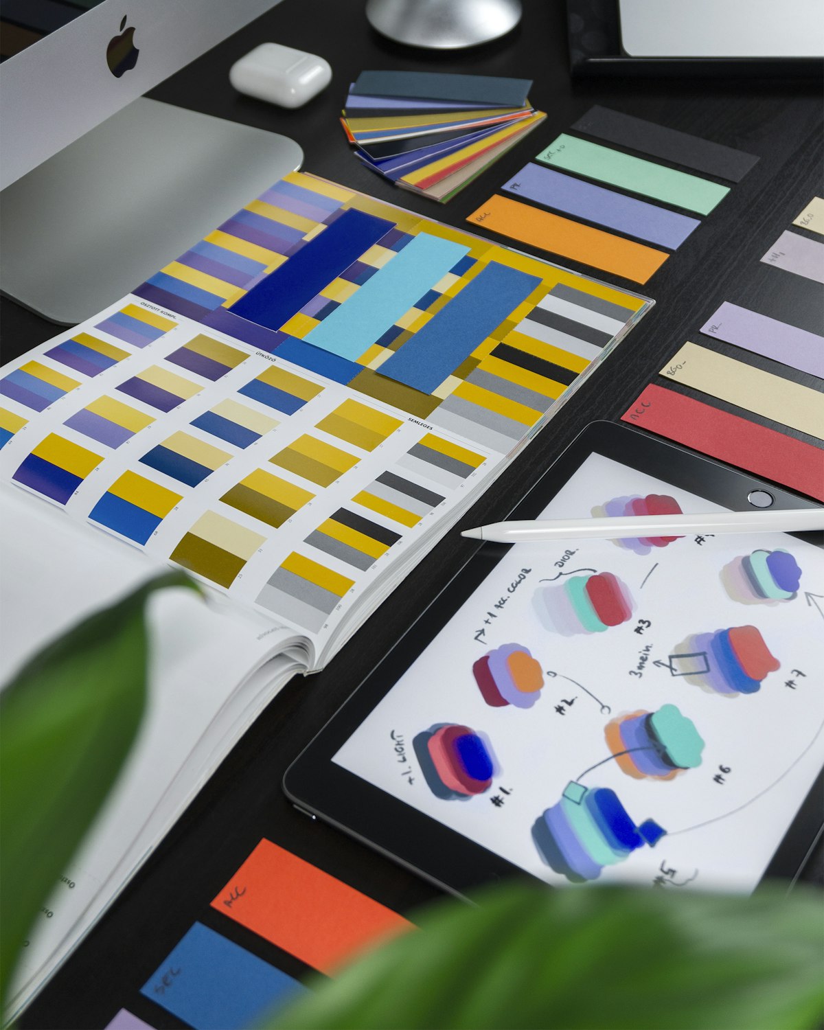
Email Design Trends That Work in 2026
Email design trends that work in 2026: layout width, dark mode, interactive elements and accessibility, with a client-support table showing what to adopt and what to avoid.
Email design trends that work in 2026: layout width, dark mode, interactive elements and accessibility, with a client-support table showing what to adopt and what to avoid.
AMP for email promised forms, carousels and in-inbox interaction. By 2026 its client support has narrowed, which means the same feature either works brilliantly or falls back to plain HTML. Here is an honest look at what interactive email is still worth, and what it costs.
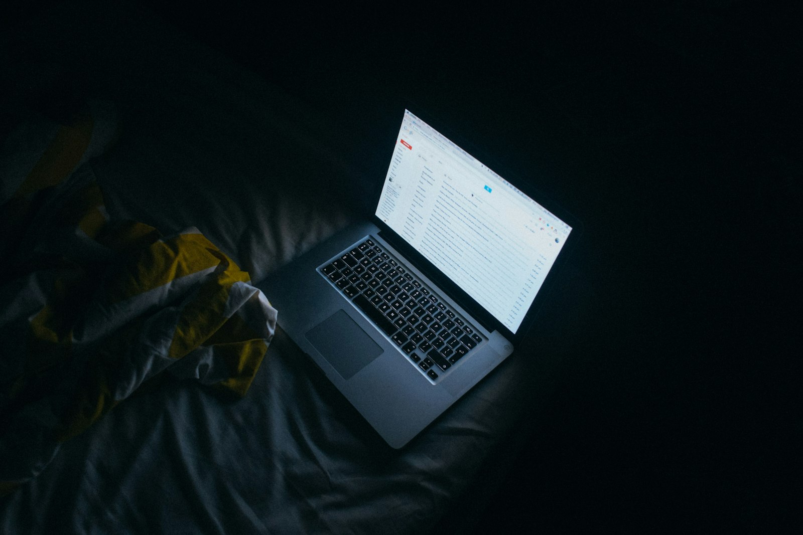
A dark mode email is not your email with inverted colours — clients transform colours, images and logos on their own terms. Here is how auto-darkening actually works, the CSS that defeats it, and the contrast and accessibility rules you still have to meet.

Preheader text is the line of copy that appears next to or below your subject line in the inbox. Here is how long it should be, how to write it, and the mistakes that waste one of your most visible pieces of email real estate.

Flodesk analysed 14 billion emails across 3 million campaigns and found that some of the most repeated advice in email marketing does not hold up. Here is what the data actually shows and how to apply it.

You may have only a few seconds to capture someone's attention after they open your email. We look at email read-time research, how quickly people scan messages, and what marketers can realistically communicate before the reader moves on.
You may have only seconds to convince someone your email is worth reading. Here is what happens from the moment a subscriber sees your sender name to the moment they decide to click, save, ignore, or delete your email.

A simple email campaign takes 4–6 hours. A standard campaign takes 5–8 hours. A complex enterprise campaign can take 15–30+ hours. Here's the real production breakdown, with time-saving tactics.

Long before inboxes existed, newspaper publishers solved the same challenges email marketers face today: capturing attention, building loyal audiences, and generating revenue through advertising and subscriptions.
We analysed 500 real marketing emails to identify design and copy patterns in high-performing campaigns. Key findings on CTA count, button colour, word count, image ratio, sender names, and subject line length.

From the hidden preheader to tracking pixels, alt text, dark mode CSS, and unsubscribe links, learn every single component that makes up a modern marketing email.

Many of the highest-performing emails don't look impressive at all. In overloaded inboxes, simplicity often outperforms complexity because it reduces cognitive friction and feels easier to engage with immediately.

Subscribers subconsciously estimate how mentally demanding an email will be before they even open it. In overloaded inboxes, perceived effort often determines whether an email gets attention or postponed indefinitely.

Starting email marketing from scratch? This complete guide covers everything from choosing an ESP and warming IPs to building high-converting onboarding flows and tracking systems.

Long, over-designed emails are losing. In 2026, short, simple, and mobile-first emails are driving more clicks, replies, and conversions.

Should marketers send simple plain text emails or fully designed HTML campaigns? Discover the pros, cons, and performance differences.